Iterative Visual Cohort Analysis
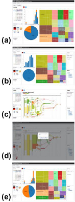
An example workflow within our system.
For example, the figure on the right shows an exemplary analysis of a cohort patients that were scored as high-risk for developing heart failure by ICDA, my team’s patient analytics platform. In (a), the user has used drag-and-drop interaction to visualize a cohort of patients produced by automated analytics system. (b) Users can explore the data and perform filter operations via direct manipulation to interactively refine the cohort. (c) Pivoting to alternative views of the refined patient cohort is performed via a simple drag-and-drop operation. (d) Additional analytics can be used to further process the refined cohort. For example, patient similarity can be used to retrieve “more patients like these.” (e) The results of the analytics are visualized to enable further exploration and refinement.
Publications
Zhiyuan Zhang, David Gotz, and Adam Perer. Iterative Cohort Analysis and Exploration. To Appear in Information Visualization.
Zhiyuan Zhang, David Gotz, and Adam Perer. Interactive Visual Cohort Analysis. IEEE VisWeek Workshop on Visual Analytics in Healthcare, Seattle, Washington (2012).
[PDF, 880k]
Sch of Inform and Libr Science